Plotting data with matplotlib
Introduction
There are many scientific plotting packages. In this chapter we focus on matplotlib, chosen because it is the de facto plotting library and integrates very well with Python.
This is just a short introduction to the matplotlib plotting package. Its
capabilities and customizations are described at length in the project’s
webpage, the Beginner’s Guide, the matplotlib.pyplot
tutorial, and the
matplotlib.pyplot documentation.
(Check in particular the specific documentation
of pyplot.plot).
Basic Usage – pyplot.plot
Simple use of matplotlib is straightforward:
>>> from matplotlib import pyplot as plt
>>> plt.plot([1,2,3,4])
[<matplotlib.lines.Line2D at 0x7faa8d9ba400>]
>>> plt.show()
If you run this code in the interactive Python interpreter, you should get a plot like this:
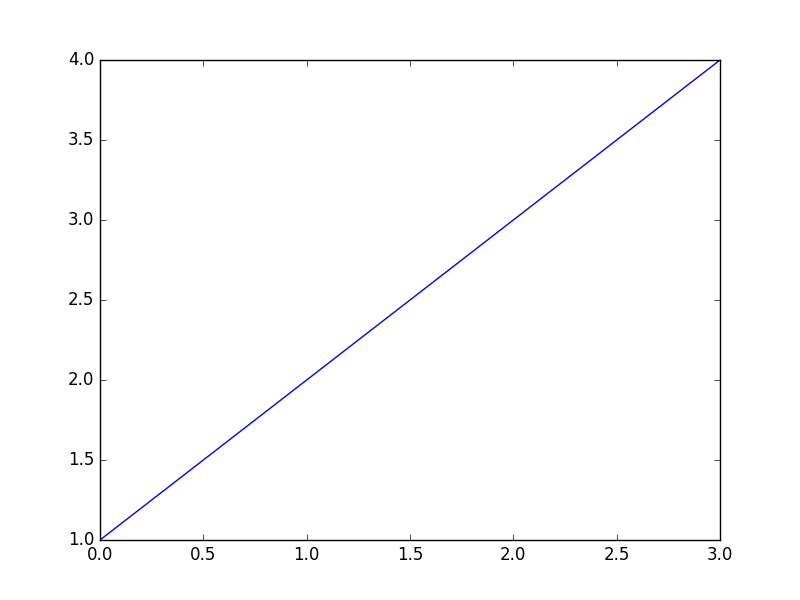
Two things to note from this plot:
pyplot.plotassumed our single data list to be the y-values;in the absence of an x-values list, [0, 1, 2, 3] was used instead.
Note
pyplotis commonly used abbreviated asplt, just asnumpyis commonly abbreviated asnp. The remainder of this chapter uses the abbreviated form.Note
Enhanced interactive python interpreters such as IPython can automate some of the plotting calls for you. For instance, you can run
%matplotlibin IPython, after which you no longer need to runplt.showeverytime when callingplt.plot. For simplicity,plt.showwill also be left out of the remainder of these examples.
If you pass two lists to plt.plot you then explicitly set the x values:
>>> plt.plot([0.1, 0.2, 0.3, 0.4], [1, 2, 3, 4])
Understandably, if you provide two lists their lengths must match:
>>> plt.plot([0.1, 0.2, 0.3, 0.4], [1, 2, 3, 4, 5])
ValueError: x and y must have same first dimension
To plot multiple curves simply call plt.plot with as many x–y list
pairs as needed:
>>> plt.plot([0.1, 0.2, 0.3, 0.4], [1, 2, 3, 4],
             [0.1, 0.2, 0.3, 0.4], [1, 4, 9, 16])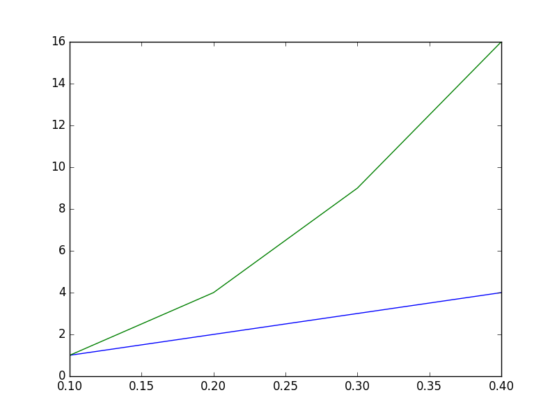
Alternaltively, more plots may be added by repeatedly calling
plt.plot. The following code snippet produces the same plot as the
previous code example:
>>> plt.plot([0.1, 0.2, 0.3, 0.4], [1, 2, 3, 4])
>>> plt.plot([0.1, 0.2, 0.3, 0.4], [1, 4, 9, 16])
Adding information to the plot axes is straightforward to do:
>>> plt.plot([0.1, 0.2, 0.3, 0.4], [1, 2, 3, 4])
>>> plt.plot([0.1, 0.2, 0.3, 0.4], [1, 4, 9, 16])
>>> plt.xlabel("Time (s)")
>>> plt.ylabel("Scale (Bananas)")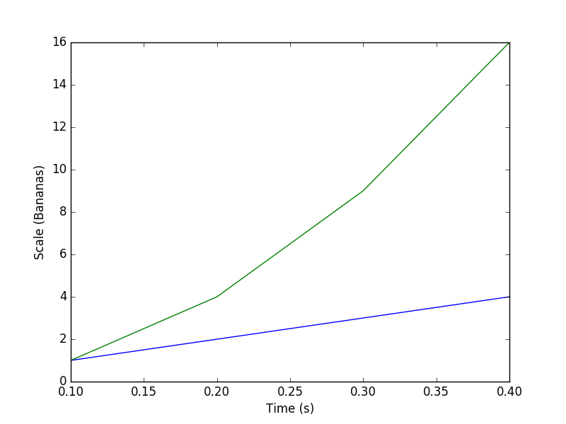
Also, adding an legend is rather simple:
>>> plt.plot([0.1, 0.2, 0.3, 0.4], [1, 2, 3, 4], label='first plot')
>>> plt.plot([0.1, 0.2, 0.3, 0.4], [1, 4, 9, 16], label='second plot')
>>> plt.legend()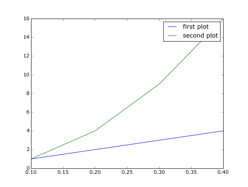
And adjusting axis ranges can be done by calling plt.xlim and plt.ylim
with the lower and higher limits for the respective axes.
>>> plt.plot([0.1, 0.2, 0.3, 0.4], [1, 2, 3, 4])
>>> plt.plot([0.1, 0.2, 0.3, 0.4], [1, 4, 9, 16])
>>> plt.xlabel("Time (s)")
>>> plt.ylabel("Scale (Bananas)")
>>> plt.xlim(0, 1)
>>> plt.ylim(-5, 20)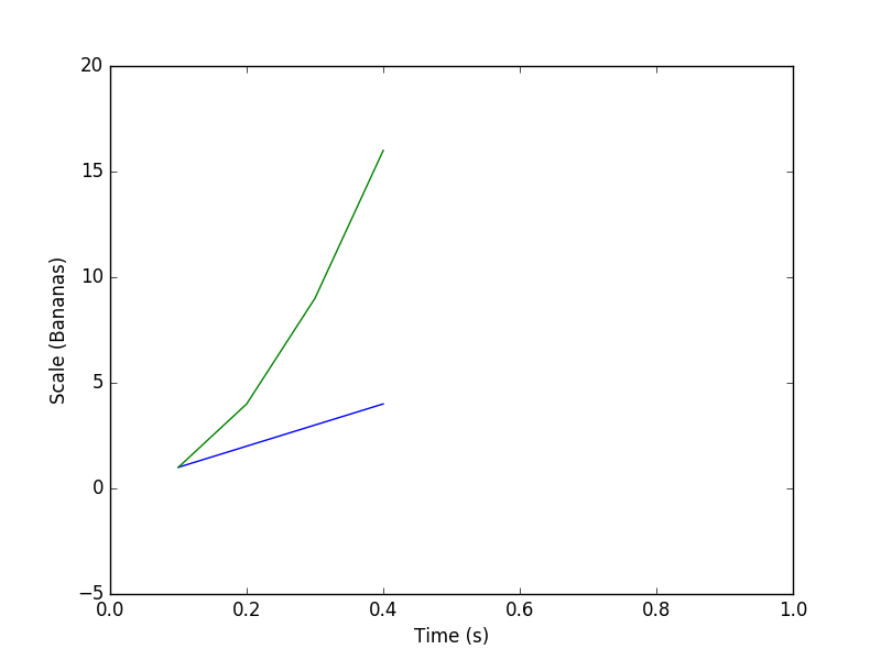
In addition to x and y data lists, plt.plot can also take strings
that define the plotting style:
>>> plt.plot([0.1, 0.2, 0.3, 0.4], [1, 2, 3, 4], 'rx')
>>> plt.plot([0.1, 0.2, 0.3, 0.4], [1, 4, 9, 16], 'b-.')
>>> plt.xlabel("Time (s)")
>>> plt.ylabel("Scale (Bananas)")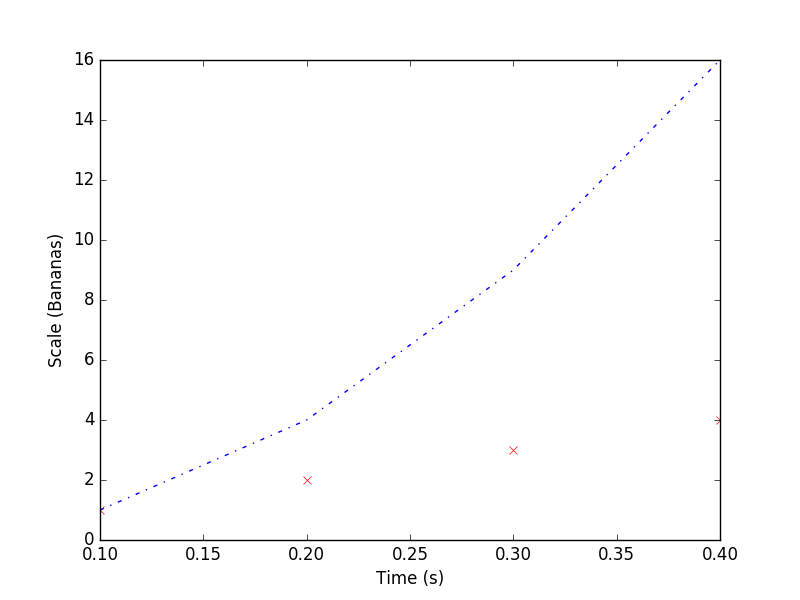
The style strings, one per x–y pair, specify color and shape: ‘rx’ stands
for red crosses, and ‘b-.’ stands for blue dash-point line. Check the
documentation
of pyplot.plot for the list of colors and shapes.
Finally, plt.plot can also, conveniently, take numpy arrays as its arguments.
More plots
While plt.plot can satisfy basic plotting needs, matplotlib
provides many more plotting functions. Below we try out the plt.bar
function, for plotting bar charts. The full list of plotting functions can be found
in the the matplotlib.pyplot documentation.
Bar charts can be plotted using plt.bar, in a similar fashion to plt.plot:
>>> plt.bar(range(7), [1, 2, 3, 4, 3, 2, 1])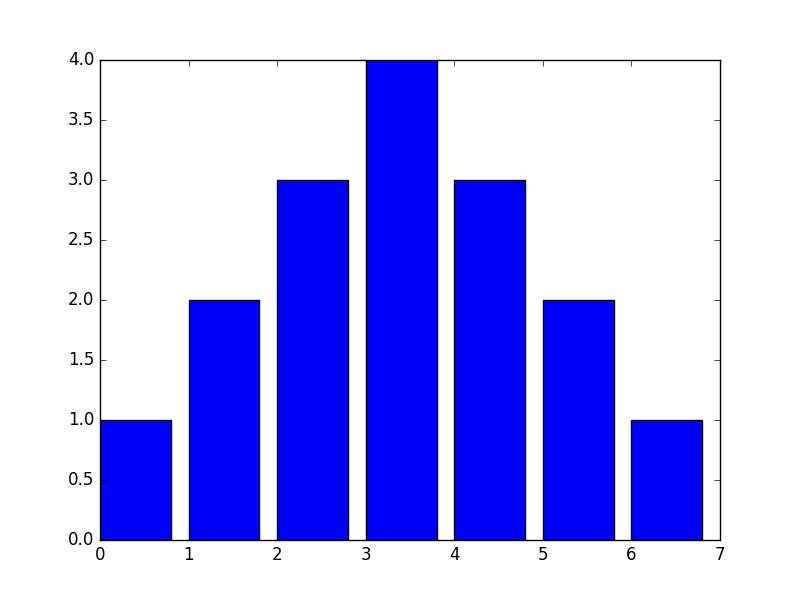
Note, however, that contrary to plt.plot you must always specify
x and y (which correspond, in bar chart terms to the left bin edges and the
bar heights). Also note that you can only plot one chart per call. For multiple,
overlapping charts you’ll need to call plt.bar repeatedly.
One of the optional arguments to plt.bar is width, which lets you
specify the width of the bars. Its default of 0.8 might not be the most suited
for all cases, especially when the x values are small:
>>> plt.bar(numpy.arange(0., 1.4, .2), [1, 2, 3, 4, 3, 2, 1])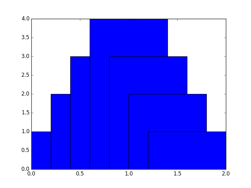
Specifying narrower bars gives us a much better result:
>>> plt.bar(numpy.arange(0., 1.4, .2), [1, 2, 3, 4, 3, 2, 1], width=0.2)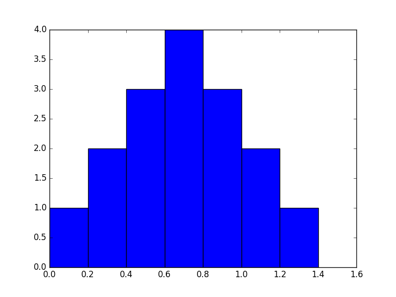
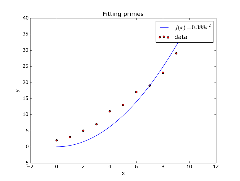
Sometimes you will want to compare a function to your measured data; for example when you just fitted a function. Of course this is possible with matplotlib. Let’s say we fitted an quadratic function to the first 10 prime numbers, and want to check how good our fit matches our data.
We made the scatter plot red by passing it the keyword argument c='r'; c stands for colour, r for red. In addition, the label we gave to the plot statement is in LaTeX format, making it very pretty indeed. It’s not a great fit, but that’s besides the point here.
Interactivity and saving to file
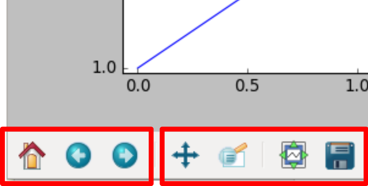
If you tried out the previous examples using a Python/IPython console you probably got for each plot an interactive window. Through the four rightmost buttons in this window you can do a number of actions:
- Pan around the plot area;
- Zoom in and out;
- Access interactive plot size control;
- Save to file.
The three leftmost buttons will allow you to navigate between different plot views, after zooming/panning.
As explained above, saving to file can be easily done from the interactive plot
window. However, the need might arise to have your script write a plot directly
as an image, and not bring up any interactive window. This is easily done by
calling plt.savefig:
>>> plt.plot([0.1, 0.2, 0.3, 0.4], [1, 2, 3, 4], 'rx')
>>> plt.plot([0.1, 0.2, 0.3, 0.4], [1, 4, 9, 16], 'b-.')
>>> plt.xlabel("Time (s)")
>>> plt.ylabel("Scale (Bananas)")
>>> plt.savefig('the_best_plot.pdf')
Note
When saving a plot, you’ll want to choose a vector format (either pdf, ps, eps, or svg). These are resolution-independent formats and will yield the best quality, even if printed at very large sizes. Saving as png should be avoided, and saving as jpg should be avoided even more.
Multiple figures
With this groundwork out of the way, we can move on to some more advanced matplotlib use. It is also possible to use it in an object-oriented manner, which allows for more separation between several plots and figures.
Let’s say we have two sets of data we want to plot next to eachother, rather than in the same figure. Matplotlib has several layers of organisation: first, there’s an Figure object, which basically is the window your plot is drawn in. On top of that, there are Axes objects, which are your separate graphs. It is perfectly possible to have multiple (or no) Axes in one Figure. We’ll explain the add_subplot method a bit later. For now, it just creates an Axis instance.
This example also neatly highlights one of Matplotlib’s shortcomings: the API is highly inconsistent. Where we could do xlabel() before, we now need to do set_xlabel(). In addition, we can’t show the figures one by one (i.e. fig.show()); instead we can only show them all at the same time with plt.show().
Now, we want to make multiple plots next to each other. We do that by calling plot on two different axes:
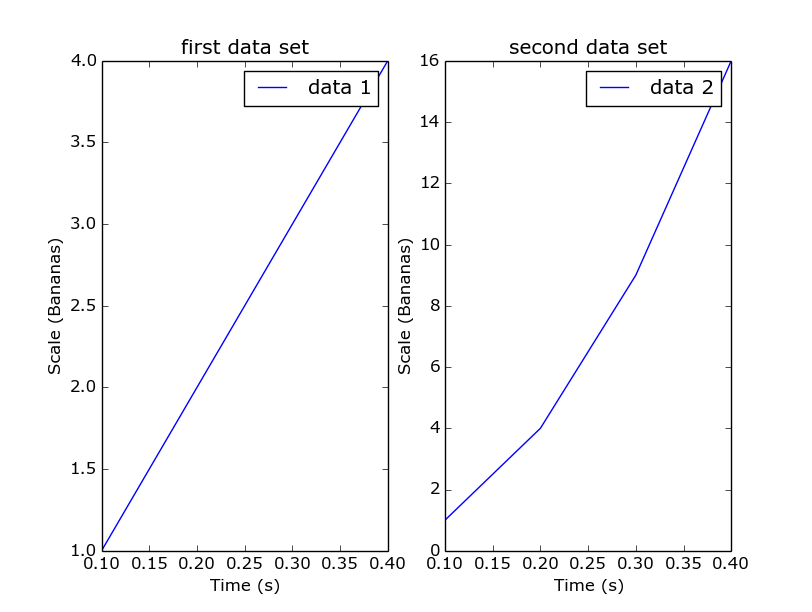
The add_subplot method returns an Axis instance and takes three arguments: the first is the number of rows to create; the second is the number of columns; and the last is which plot number we add right now. So in common usage you will need to call add_subplot once for every axis you want to make with the same first two arguments. What would happen if you first ask for one row and two columns, and for two rows and one column in the next call?
Exercises
- Plot a dashed line.
- Search the matplotlib documentation, and plot a line with plotmarkers on all it’s datapoints. You can do this with just one call to
plt.plot.